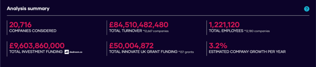
The human health services (HHS) sector constitutes the largest sector of the life sciences RTIC in terms of business counts. Concerning the care of human health, we all know the role this plays in our lives, but some may be unaware of the sectors’ financials (particularly in the last few years).
Introducing Myself
Before I tell you about my findings, I would like to introduce myself. My name is Ansar Lala and I am a 3rd year physics undergraduate at the University of Leeds. I recently joined The Data City on a 30-hour placement scheme as part of my degree and I thoroughly enjoyed my time here. The hospitality shown by the entire team quickly settled any lingering nerves I had before stepping into the office.
Leveraging Data Explorer to identify companies
During my placement, I had the amazing opportunity to become familiar with The Data City’s product and all of its advanced features. Assigning meaning to the features and findings was important, which is where the accreditation programme came in.
By upskilling myself in navigating the platform and building lists, I was able to get to grips with the product and I would highly recommend it due to the fantastic and easy-to-follow teaching methods Fatima uses during the videos.
Using the keywords from the life sciences taxonomy file, I created a list of companies that best represented the sector. This was then exported as a CSV for further analysis (where the real magic begins).
Diagnostics of the HHS sector
Initially I wanted to explore how well this sector was performing regionally and decided to plot a pie chart showing the total turnover per NUTS1 region.
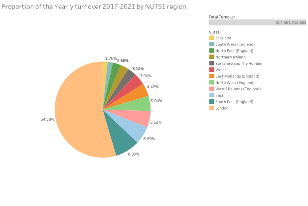
Although you can infer from this pie chart that London seemingly dominates turnover statistics with over 50% of the total turnover from 2017-2021, in order to deduce whether this statistic is misleading I wanted to find out:
- How the turnover is affected by the number of companies operating in each NUTS1 region.
- How the turnover is distributed within each NUTS1 region and company growth stage
By combining the dataset with the geospatial file obtained from Open Street Maps, I mapped out the turnover for each local authority.
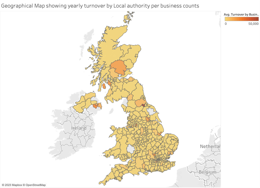
Some interesting points:
- The majority of London’s turnover comes from 2 regions, Kingston upon Thames and the City of London with average turnovers of over £40,000 and £120,000 respectively per business count.
- However, the spread (standard deviation) of both regions was over £200,000 for Kingston upon Thames and approximately £600,000 for the City of London.
- The best performing region was Darlington with an average turnover £130,000. Similarly, the spread of this turnover was high at over £250,000.
These findings seem to show that there is a disparity in how the turnover is distributed in each NUTS1 region where 1 or 2 companies dominate these statistics. This can be highlighted in the following bar chart.
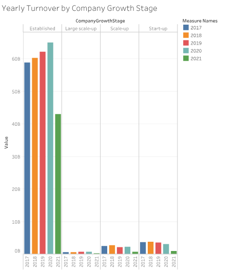
- Established companies contribute the majority of the total turnover (approx 90%) from 2017-2021
- There has been a massive drop off in 2021 with £30 billion lost in total in this sector, likely due to the effects of the pandemic.
Concluding the HHS sector
The Data City’s product helps reveal the economic data that is imperative in understanding human health services. It provides an important second viewpoint on the sector and helps see it as more than just doctors and medicines. This could help to shine a light on improvements to healthcare, as well as capture public sentiment.