Get ready to experience the revamped Data City platform! It’s the familiar tool you know and love, now with exciting updates designed to enhance database navigation.
What’s changed?
Being a refresh and not a full redesign, the UI should still feel familiar to those who have used the platform before. Don’t worry – we haven’t aimlessly moved everything about!
Here’s the short version:
- The main navigation pane (at the top) has been moved to the left-hand side.
- We’ve streamlined the list building process.
- Using filters is now more intuitive.
Main navigation
The ‘main navigation’ (where you would navigate to EXPLORE, ANALYSE, etc.) was previously placed at the top of the page. We’ve now moved it to the left-hand side.
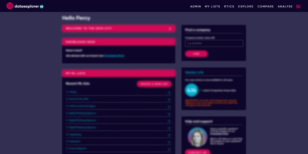
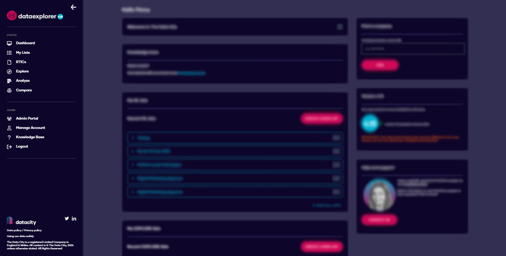
This makes a big difference when using the platform. Now, not only are the main navigation elements easier to reach, but you have more vertical space when using the platform. Win-win.
Streamlined list building
List building is one of the defining features of our platform, so we wanted to update to provide a simpler and more enjoyable experience.
The process should now be easier for newer users to jump into, while being streamlined and quicker to use for those who are experienced.
Here’s the old version:
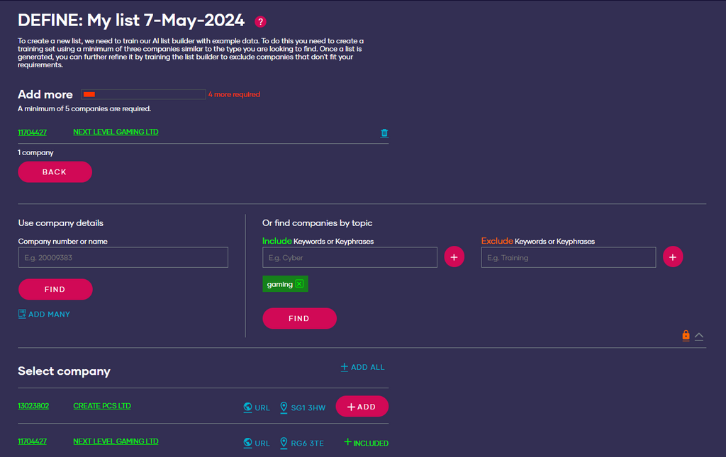
Adding companies to a list has now been updated, allowing users to easily see and review their list without having to scroll to the top of the page.
Now let’s take a look at the new version:
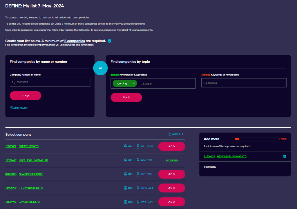
As you add companies they will pop up at the edge of the screen.
The window will follow you as you scroll which gets rid of the constant need to scroll to the top of the page and saves you some valuable time.
More intuitive filters
Filters are a pivotal part of the platform for EXPLORE, ANALYSE and COMPARE.
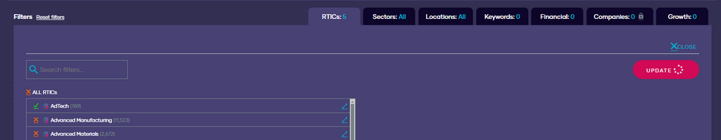
With the addition of several new key data points and features, we’ve updated our filters to make them more intuitive. The most important change we’ve made is a new filter update button, which ensures your filters changes are reflected in your results.
Now, once you’ve made changes to the filters an update button will appear:
And if you try to close the filters section without applying, you’ll get a pop-up asking whether you’d like to implement the changes or discard them.
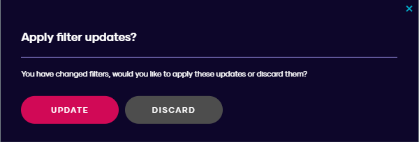
It means that the companies you are seeing are always aligned with the filters that you have applied.
Let’s make it even better
In addition to feeling much better to use, the platform also looks better by matching our branding much more (but you probably already noticed from the screenshots!).
These are just the things that we thought were most important to start with, but we’d love your input. What do you think of these new changes? Anything you’d like to see changed next? Please let us know by getting in contact.
Want to explore the shiny new platform UI for free? Sign up for a trial!