Benefits of mapping our data
Our data is intrinsically geographic. Maps, therefore, offer a critical tool for interrogating and understanding our data. Such a visual representation allows for easy comprehension of the complex information that we hold. By displaying data on a map, patterns, trends, and relationships between different locations become more apparent, aiding in identifying spatial variations and making comparisons. Mapping data enhances communication and collaboration, as visual representations are often more accessible and engaging than raw data tables or spreadsheets.
Choropleth maps, specifically, offer distinct advantages for displaying quantitative data across predefined regions. By using colour gradients or shading, choropleth maps allow for a clear depiction of variations in aggregate data values, making it easier to identify hotspots or areas with specific characteristics. Choropleth maps are particularly useful for highlighting spatial patterns in indicators such as business counts, turnover, employee counts, or any other attribute that can be aggregated at the region level. They provide a simplified way to understand and communicate data at a glance, making them valuable tools.
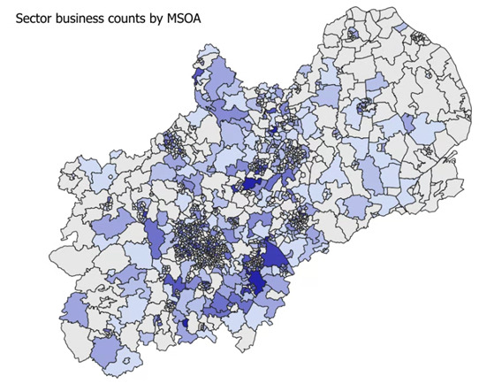
Both ourselves and our users benefit immensely from this, identifying and exploring spatial patterns and supporting informed decision making. But could 3d maps have the potential to extend these capabilities of 2d maps?
Intro to 3d mapping
3d maps can also present an intuitive visualization of aggregate data. By utilizing extrusion techniques, where the height of each area is proportional to the size of the data, 3d maps offer a visual representation that can effectively convey the variations in the data across different regions. This allows users to quickly identify areas of dense activity and visually compare them much quicker.
3d maps still support the integration of multiple layers of information, such as infrastructure or landmarks, to provide context and aid in understanding the distribution of population. By adding buildings, roads, or landmarks, 3d maps can provide a more comprehensive view of how population is distributed in relation to the physical environment. Overlaying administrative boundaries and other physical landmarks helps orientate the data, enabling its extraction in context, supporting analysis and data storytelling.
Additionally, 3d maps can offer an interactive and immersive experience, allowing users to explore the data from different angles, zoom in and out, and interact with the map. This interactivity facilitates a deeper understanding of data distribution, allowing users to identify trends, patterns, and potential correlations that may not be immediately apparent in traditional 2d maps.
Overall, 3d maps can provide an engaging, informative, and interactive representation of aggregate information, enhancing spatial analysis and decision-making processes.
Exploring the Midlands in 3d
So we wondered, could 3d mapping offer any additional benefits in the visualisation of our data? Whilst most stories in our data can be told with traditional choropleth maps, could 3d maps highlight any insights missed in the 2d maps? Working with Midlands Engine, we have explored the potential of 3d maps for our data further.
Choosing the geographic boundaries
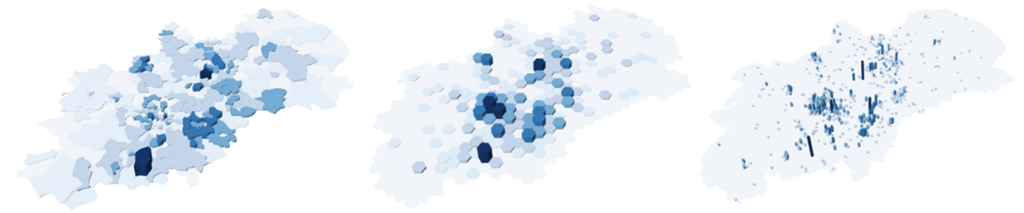
When developing maps of any kind, it is key to be mindful that larger regions with higher densities of data may dominate the visual representation, overshadowing smaller regions with different characteristics. This is particularly true for 3d maps, where the dominance of regions with larger surface areas is compounded. To remove this visual weight bias, we decided to apply a consistent 1km hex grid to the data and the map, in turn, reducing the impact of administrative geographic boundaries, and facilitating the data to reveal itself at an extremely granular aggregation.
Software limitations
3d mapping software is still in its infancy, with most elevation mapping capabilities being primarily developed for depicting the physical topology of a geographic extent. Working with Alasdair Rae, an expert in data visualisation and founder of Automatic Knowledge, we developed a workflow underpinned by a hybrid approach, incorporating both R and QGIS in the data preparation, and utilising graphics software to develop the final elevated maps. Although both R and QGIS, for example, have 3d mapping functionality within themselves, the quality of the visuals in the final outputs are limited, and the functionality is inflexible. Though the final workflow involves significant manual intervention, achieving the impressive, high specification output that we were seeking is still not possible, at this time, in an automated, or even singular, process.
Other considerations
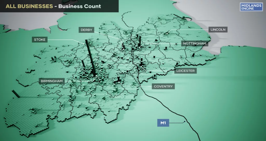
Since our outputs were to be static images presented for comparison, each representing different data variables, other considerations such as consistent scale, zoom, use of colour and shading, the angle of the projection, and the placement and scale of additional physical features, all had to be carefully considered to achieve the most successful data representation, whilst maintaining the aesthetic of the map. Treading the fine line between effective and cluttered, we settled on overlaying the Local Authority boundaries, the M1 motorway, and labels of key cities and HE/R&D institutions, to support users (both familiar with the local landscape and otherwise) to orientate themselves in the region and aid in their insight development and storytelling in context.
Final outputs
Our final outputs were a series of maps which fed into a wider report for the Midlands Engine, exploring the investment potential of the Midlands. These maps provide successful illustrations of the data, enhancing Midlands Engine’s understanding of the region, and both support and drive their accompanying narrative. The maps are equally impactful and insightful, and when considered as a collective, demonstrate a holistic picture of the investment potential of the region. Whilst the same could have been achieved with 2d maps, the immediacy in which the 3d maps can be interpreted, compliments the detail contained within the main body of the report.
Decision time – 3d or not 3d?
Was this test a success or are 3d maps superfluous?
These visualisations are undeniably more striking than 2d maps and much more visually interesting, adding an intriguing dimension to the report. Most importantly, we have achieved this aesthetic whilst not compromising on the quality of the data, or the ability to accurately interpret and translate the results. Whilst the maps are more complex in their creation than 2d maps, their appeal is understandable, and their potential benefits in particular situations are plain to see.
However, maintaining this balance in their development has taken a great deal of consideration, and this might not be a medium which is applicable in all situations. We have still only visualised one data variable on each map, and the physical landmarks overlaid are necessarily restricted to avoid cluttering the visualisation. Therefore, a balance of both 2d and 3d maps, where the data calls for them, is likely the best approach, to leverage the strengths of both visualization techniques and gain a comprehensive understanding of spatial data.